Using Layers
The Layers feature in the Map Module provides a variety of data to select to display over the viewing area. You can use the Layers feature to display the following information:
Display categories;
Choose to view data on a scaling map;
Plot data in the form of different graphs (pie chart or bar chart);
Display map features such as department or commune borders.
The following layers can be applied in DAD:
Categories
This option is used to plot category data on the map and to view them in the form of different icons / images. To enable this option, expand the Category section and selecting the category(ies) listed.
Note: When pointing the mouse cursor on a respective icon/image on the map, you can view the details for the selected category.
Scaling
This option is used to view the data on a scaling map. This means that the selected data series will not be displayed in the form of graphs, but the administrative territories will be colored according to the selected scaling category instead. The scaling legend at the bottom left side of the map prompts on the coloring pattern used.
To enable this option, expand the Scaling section in the Layers panel and select one of the possible alternatives listed.
Chart
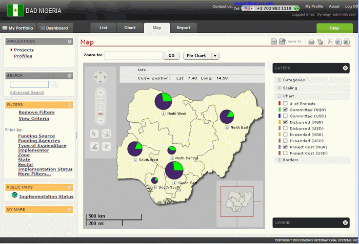
You can plot different data series on a map and view them in the form of different graphs, such as pie charts or bar charts. You can turn on this option by expanding the Chart section in the Layers panel and selecting the chart category(-ies) to be displayed on the map. By default, the selected category(-ies) will appear in the form of a bar chart. However, you can choose the view the data in the form of a pie chart by selecting the appropriate option from the Chart Type drop-down (Figure 21).
Note: When pointing the
mouse cursor on any of the chart constituents, you can view the
data that stands behind it. The details on plotted chart categories
are displayed when clicking the ![]() button.
button.
 |
Figure 21: Selecting Chart Type |
Borders
You can turn on border information by expanding the Borders section in the Layers panel and selecting one of the following options:
Auto - displays border information for all territorial units when the zoom in is selected. For example, if you zoom in to commune level, the border information for both departments and communes will be displayed on the map.
Zone - displays the border information for all regions.
State – displays the border information for all departments.
LGA - displays the border information for all communities.