Viewing Legend
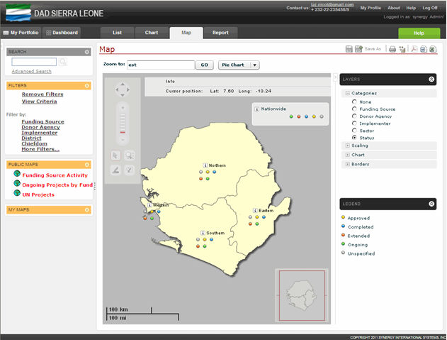
To explain the data series or categories on the map, the legend is used to identify the patters or colors that are assigned to the selected categories (Figure: Viewing Chart Legend). It is worth mentioning that each data series or category is represented by a unique pattern or color in the map legend, which is displayed in the following ways:
In the Legend section if you have chosen to apply any category to the map.
At the bottom left side of the map if you have selected to view data on the scaling map.
 |
Figure: Viewing Chart Legend |